CONFIDENTIAL, 2024
Context
Scotch is a premium solution for liquor retailers, offering a top-tier product backed by the best team and partners in the industry. Retailers can feel proud to work with Scotch, enjoying a luxurious yet approachable experience. It's all about efficiency, helping save time and streamline operations, while ensuring reliability and security every step of the way.
The Goal
The client shared initial thoughts on the issues, including general clunkiness of common operations, outdated and confusing UI, and the rigidity of their systems. With this in mind, our goal was to create a modern, more intuitive design that makes everyday tasks easier and faster. By redesigning the wireframes and offering clearer instructions and insights into the actions users need to take, we aim to move the product from being just "good enough" to something far more valuable for the user.
Solution
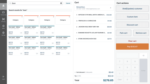
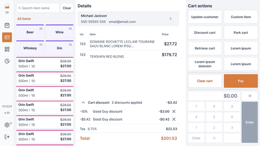
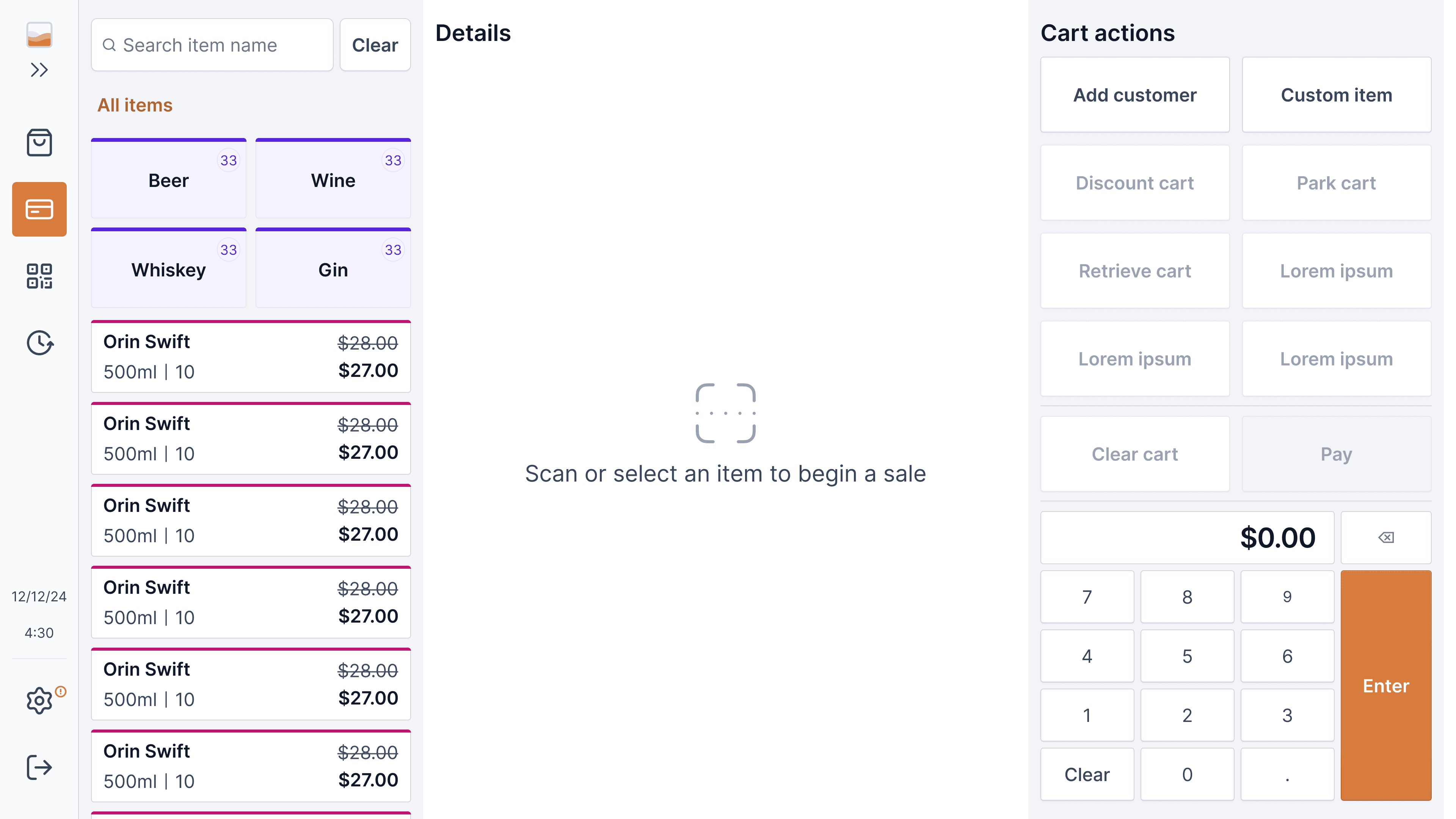
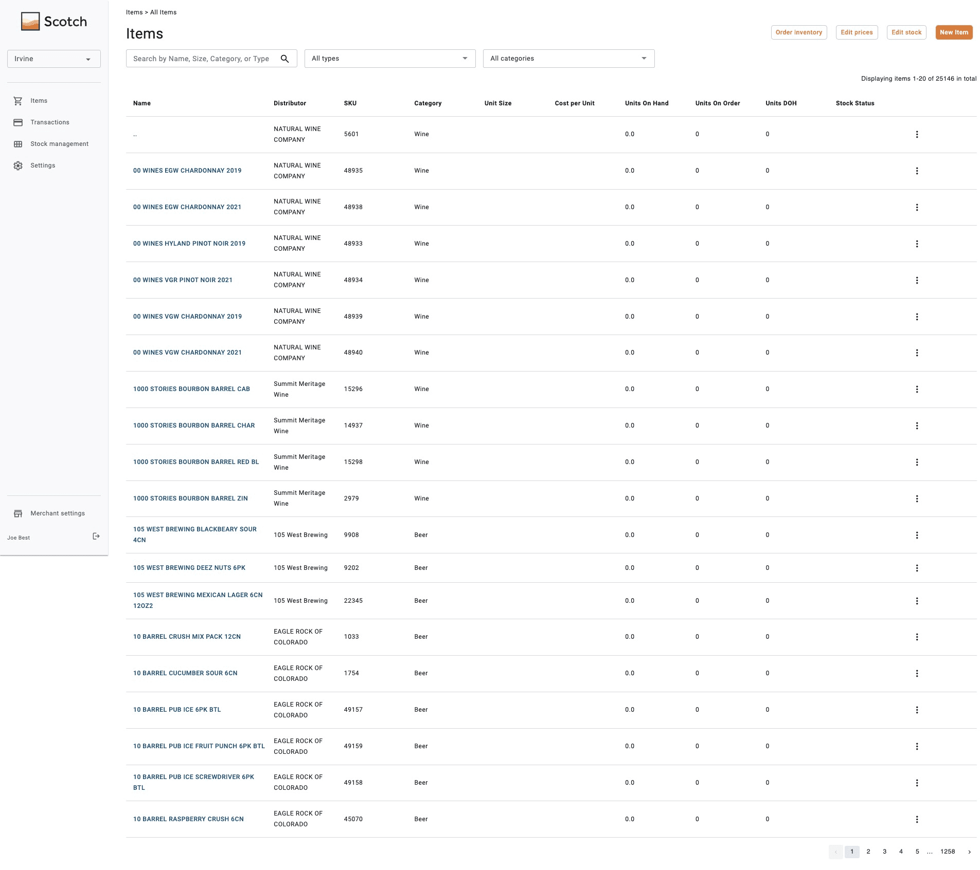
In redesigning the platform, we began by understanding the purpose of the initial sketches, the main actions in each flow, and the target end users. With this information, we focused on incorporating accessibility and intuitive flows, keeping in mind that users would be viewing the screen for eight-hour shifts. Since the touchscreen is used at arm's length for medium-volume transactions, we increased the size of elements in the wireframes and structured the flow to facilitate easy decision-making.
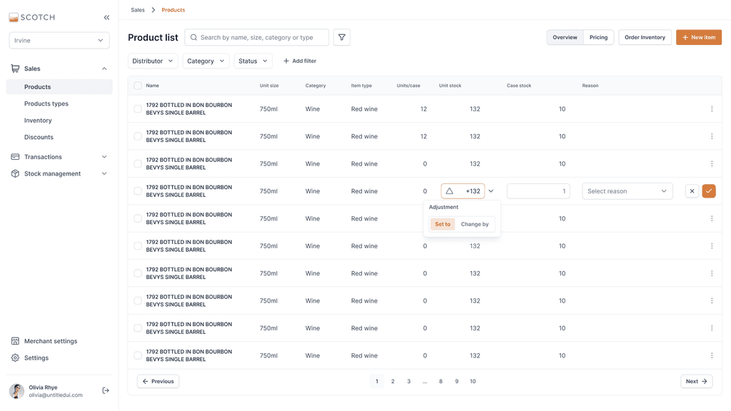
By applying consistent patterns for components, labels, and workflows, we enhanced the product's speed and intuitiveness. For the back office, we first analyzed the product's business rules and identified what users needed to quickly update or input regarding inventory, stock adjustments, and purchase orders. Maintaining a focus on easy decision-making design, we aimed to help users understand how the product operates while bringing a distinct personality to the Scotch brand.
The Market Opportunity
As the client highlighted, the current market is filled with systems that are "good enough" but often feel outdated, lacking modern, accessible, and intuitive flows. This creates a significant opportunity for Scotch to differentiate itself by offering a streamlined, user-friendly product that goes beyond basic functionality. By addressing common pain points, there is a potential to deliver a solution that not only meets but exceeds user expectations.
Benchmarking
We analyzed both vertical and horizontal competitors in the market, gathering insights on common patterns, user flows, and potential improvements. This analysis helped us better understand user needs and mental models, allowing us to translate these findings into meaningful improvements for Scotch's product and its users.
Wrapping Up
In redesigning Scotch, we addressed issues like clunky operations and outdated UI, focusing on making the product more intuitive and efficient. We applied consistent patterns to reduce cognitive load and streamlined tasks like inventory management for quicker decision-making. The result is a user-friendly product that’s easier to navigate and better suited to Scotch’s unique needs.
This redesign adds real value by improving productivity and reducing errors, allowing users to work faster and with greater confidence. The intuitive design not only enhances the user experience but also increases the overall efficiency of daily operations, ensuring Scotch becomes a more valuable and reliable tool for its users.`
Ready to Build an Amazing Project?

